

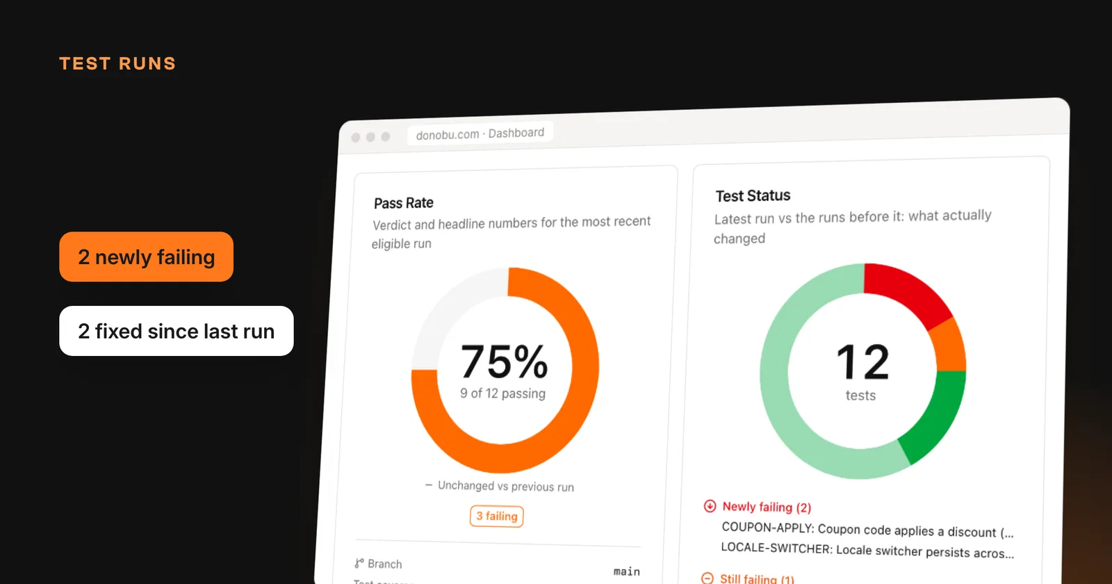
End-to-end test results have always had a locality problem. The suite runs on a laptop or a CI box, and the results live wherever they happened to land. When someone asks "is checkout healthy?", the honest answer is often "ask whoever ran it last." That is not a quality process. That is folklore.
Over the past few months we rebuilt the Donobu dashboard around a different unit: the test run. Here is what that looks like.
One sign-in, one source of truth
Sign in to Donobu Studio with your Donobu account, and your test runs, flows, and videos sync to Donobu Cloud automatically. Teammates see results without needing access to the machine that produced them.
Signing in only changes where results are stored. It does not change which AI model executes your tests, so you keep using your own configured provider for inference.
A dashboard that thinks in runs
The dashboard opens on your most recent run and compares it with the runs before it:
- Pass Rate: the verdict for the latest run, how many tests passed and self-healed, and the change against the previous run
- Test Status: what actually changed, split into newly failing, still failing, and fixed since the last run
- Flaky Tests: the flake rate over recent runs and the tests driving it
- Run History: the result of each recent run at a glance
- Tag Health: pass rate by tag, worst first
- Top Offenders: the tests that fail most often
Tags flow in automatically from Playwright's testInfo.tags, so @smoke and @checkout mean the same thing on the dashboard as they do in your repo.
Test runs are now a first-class object
Set DONOBU_RUN_ID once in your CI step and every flow that pipeline produces, across parallel shards and workers, groups under a single run. Each run also records where it came from: git branch and commit, the CI provider, and a link back to the workflow run. GitHub Actions, GitLab, CircleCI, Buildkite, Jenkins, and the other major providers are detected automatically.
The Test Runs table shows each run's start time, run ID, branch, CI link, duration, test count, and a pass-rate badge. Two details we are fond of:
- You define what counts as a run. By default only CI runs are included, and you can filter by branch or match run IDs against a pattern like
release-*. An engineer debugging on a laptop no longer pollutes release statistics. - Categories let you slice runs into the groups your team already thinks in, such as nightly, release, or smoke, and compare a run against its own cohort.
The run page answers the Monday morning question
The question is never "what is the pass rate?" It is "what broke, and is it new?"
Open any run and you get exactly that: newly failing, still failing (with streaks, such as "failing for 6 runs"), and fixed since last run, plus the pass-rate change against the previous run in the same category.
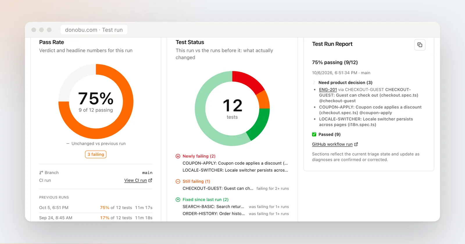 Each failed test carries its AI failure analysis and a seekable recording with step markers, so triage does not require a local repro.
From the same page you can copy a paste-ready Slack summary, copy a CI re-run command covering the failures, and, if your workspace is connected to Linear or Jira, turn a failing test into a ticket without leaving the page.
Why this matters
We call the goal Continuous Quality: testing that runs with every change, not before every release. That only works if the results are somewhere the whole team can see, argue with, and act on. The dashboard is that place now, and it stays fast even on suites with thousands of runs.
See what has shipped recently on the changelog, or book a demo to walk through the dashboard with your own suite.